18 Feb A logo that represents the path to agreement
The logo of Daniel Sererols, Conflict Mediator, is much more than just an image: it is a visual representation of the will to build bridges, foster understanding, and reach fair agreements between conflicting parties.
Shape and structure
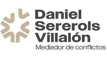
The logo has a circular shape in beige tones, a color that conveys calm, neutrality, and balance. The circle, a universal symbol of wholeness, unity, and inclusion, evokes the idea of a round table— a space for dialogue and collaboration where all voices hold equal value.
An open circle under construction
The design is not a closed circle, but is formed by open pieces that converge to create a unit, reflecting the dynamic nature of mediation: a process in constant construction where the parties move towards a joint solution.
The missing piece: the step towards agreement
Within this structure, there is a piece separated from the circle, a visual metaphor for the mediation process. This piece represents the initial point of disagreement, the distance between the parties before finding common ground. However, its design and position suggest that it is about to fit in, completing the circle and closing the conflict resolution process.
Message and meaning
This logo clearly communicates the philosophy of mediation: a path to resolution based on dialogue, cooperation, and the search for mutual agreement. The open structure reflects that, in any conflict, the parties are not isolated but in motion, advancing toward a common solution.
![]()
This design conveys an essential idea: all conflicts can find a piece that resolves them, you just have to work to fit it in.
The designer of the logo is Belén Bach Serra, from the team at Genèric Disseny.
